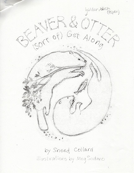
Book covers are important and a challenge to design. They have to be attractive, expressive, and include the main characters in action. We want kids and parents to notice a beautiful book on a shelf, pick it up, and wonder what’s inside. My Designer guided me through numerous versions of the cover illustration for Beaver and Otter Get Along …Sort Of. She shared my images and received feedback from many people behind the scenes: Editorial, Design, Production, Marketing, and Sales Teams. Everyone wanted Beaver and Otter to be a success!
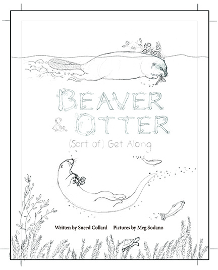
I started with sketching some ideas and I settled on two to submit to my Designer. That’s where this show-and-tell begins.
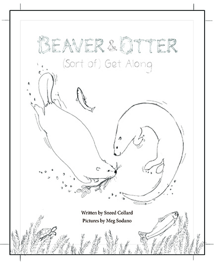
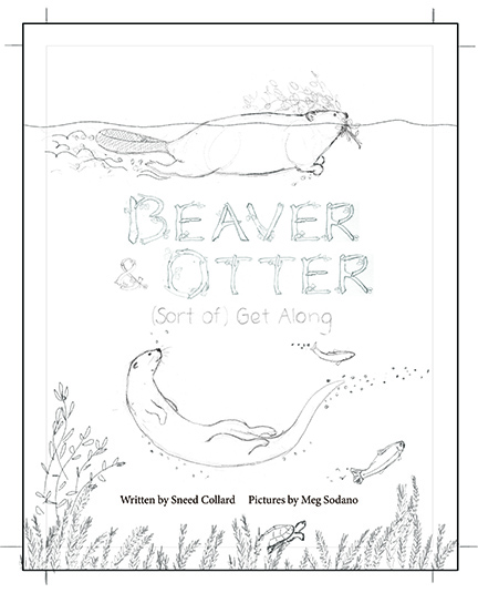
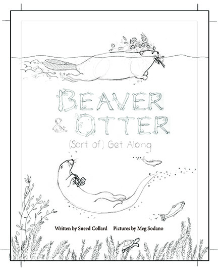
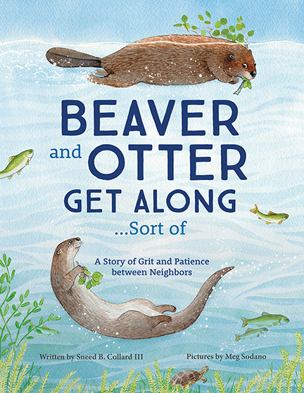
▲ Pretty basic, but I show the main characters interacting in a yin-yang pose. ▲ Another idea. This time I included their environment and some text. The handmade font reflects the characters’ location.▲ My Designer suggested I put the title between the characters and the credits on one line at the bottom. We both really liked this one. But there was something missing…▲ Otter needs to hold something in her paws! How about a fish?▲ My Designer preferred leaves. Ok, I can make that happen. (I really liked the fish, though.) The animals look great, but their eye contact needs work. And Beaver should be annoyed at Otter.▲ Oh yes! See the difference? The adjustment on Beaver’s face seems simple, but his expression is strong! He means business. He has lots of work to do and can’t play around like Otter.▲ I added watercolor to show depth, texture, and the realistic colors of the animals and plants. Now Beaver and Otter have a home! But the branches as text? Hmm, probably too much. I sent it to my Designer, who asked me to put all the text on a second layer (good idea).▲ Tada! The cover for Beaver and Otter is complete!